Pages

Showing posts with label Drawing. Show all posts
Sunday, January 28, 2018

Walk Cycle

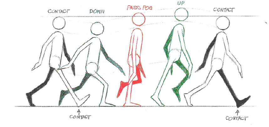
Throughout my blog posts I've talked a  great deal about walk cycles, but I've given little information about them. Walk cycles are crucial in animation, as they make up the majority of actions in any given shot, and according to Richard Williams, are "about the toughest things to do right" (102). There is a general formula that most walk cycles follow, but as Williams writes time and time again, "All walks are different...no two people in the world walk the same" (103).
contact_method.jpg (858×406)
This is the general formula for walk cycles. If you look closely you will see a set of curved lines around the head of the walk cycle, and that line is the golden rule. Almost every cycle follows those lines. According to Williams, the above image is a "normal" walk cycle, where the weight goes down just after the step and the weight goes up just after the passing position (108).
When I tried this method, I followed the example above. The positions are labeled, and I found William's method a very easy and simple one to use. What are some things I could add to make varying walk cycles?

Straight ahead VS pose to pose

In The Animator's Survival Kit, author Richard Williams describes two types of animation: Straight Ahead and Pose to Pose.
Straight Ahead animation, as described by Richard Williams, is "[to] just start drawing and see what happens - like a kid drawing in the page corners of a schoolbook - stick the numbers on afterwards" (61). Frame by frame, an artist can work to complete the piece without worrying about the technicalities, and can include as many spontaneous twists as they would like. This method allows for a lot of artistic liberty, and can be very fun to do. On the other hand, however, this method can be wandering, messy, and inconsistent (Williams 61).
In order to try this method, I animated a simple walk cycle. Instead of planning out what I was going to do, I just began making frames and adding whatever I liked. It was very fun, but as just as Williams warned, was messy and unstructured.


The second method of animating is called Pose to Pose. In this method, the key frames are placed first, exactly where you need them. Then, the blank frames in between the key are filled with tweens. This method is far more structured than straight ahead, but it can be less fun and more predictable. Williams lists "Where's the magic?" (62) as a con, and when I tried this method I found myself agreeing.
This method, although easier to space out, felt much more mechanical and less stylized. My question is: is there a noticeable difference between the two animations?

A relaxed attitude about drawing

So far, we've examined lines, and the emotions they convey, as well as how they affect the outcome of the drawing. We've examined different ways to warm up before we draw to prepare our mind for artistic expression, as well as the job of the onlooker in a piece of art. Finally, I will leave you with a lasting outlook on drawing, and the art you create.

Art and artistic expression has been around since the dawn of humans. We have always tried to express ourselves through less and less logical or conventional methods. One of the more simpler expressions is drawing. Today, I want to impress upon you the importance of having a relaxed attitude about your drawings and creations. 

This outlook is very important for every artist for several reasons. First: It allows your body to not be tense, to feel flexible and even spontaneous. Second: Ultimately, an artist must express themselves, and, as Clayton states, "The process [is] more important than the product" (5). Third: It allows drawing to be a lot less of chore, and more of a fun release of creative energy. I struggle a lot with trying to draw precisely or not relaxed, and it makes my drawings stiff, and frankly, terrible.

Here are some quick drawings I did, for no other purpose than to relax and have fun.


Do you find that drawing to relax produces better results than drawing to produce results?

Clayton, Elaine. Making Marks: Discover the Art of Intuitive Drawing. Atria Paperback, 2014.

Tweens and Keys

No matter what it is you're animating, one of the most important concepts to understand is the difference between key and in between frames.

Key frames, as defined by Richard William in the Animator's Survival Kit, are "The drawing or drawings that show what's happening in the shot" (57). These frames are the ones that tell the actual story, and they are crucial to understanding what's happening. These should be your most powerful and dynamic drawings, as they need to clearly illustrate what's happening in the animation.


In contrast to keys, there are in-between frames, or tweens. These drawings fill the space between each key, and they are crucial in a way that is far different than the key frames. Without these drawings your piece would appear choppy and discontinuous. Tweens keep the continuity of the piece fluid and smooth.

In order to practice these methods, I drew a series of key frames in a walk cycle. Through these few drawings you can easily make out what is happening in the picture, and I found Richard William's advice to be very helpful while completing this. What do you guys think about this?


Perception of lines: A creative approach

In my past posts, I have talked extensively about how different lines affect the mood of a piece of art, and this week, I will further this concept. Previously we have explored how lines feel, and now we will look into the role of the viewer of a piece of art.

I have repeatedly spoken to the importance of using lines in art, and the effect it has on a viewer, and now we will put ourselves in the role of the viewer. Elaine Clayton states, "We use our five senses to give context , or meaning to everything we encounter. Art forms such as lines and shapes represent elements from our experiences in the world, either symbolically or literally" (26). In other words, the artwork that an artist produces is only the beginning of the artwork, and the viewer's interpretations complete it.

This picture is an example that Elaine uses to demonstrate how to use your interpretation of drawings. The lines and shapes alone seem to more sad than energetic. The downward slope of the line, and the gentle wave creates this emotion. Although it has no recognizable shape, we can still see the emotion behind it.

Here we have the same picture, but rotated. The rotation brings to light what the shape actually is: an eye with a tear drop. We saw the saw the shapes as themselves, unattached to a finished product. Art is what we make of it. Do you find this to be true?

Clayton, Elaine. Making Marks: Discover the Art of Intuitive Drawing. Atria Paperback, 2014.


Thursday, January 25, 2018

Drawing an Automobile

For my fourth post, I will be drawing a car or an automobile, and I will be using linear perspective to help make it look a little more realistic. In the book, the Willenbrinks explain to us that, "Perspective is what gives the illusion of depth to a picture. It affects almost anything we see, if only in subtle ways...,"(32) which means that drawing with perspective is essentially giving your drawings sort of a three dimensional like feeling. There are three parts to using linear perspective, there is the horizon line which is,"...where the land or water meets the sky," and it is explained that it, "...Influences the viewers perception of a scene and determines where its sight lines should converge,"(Willenbrink 32) and then there is the vanishing point, which is the point where lines converge, and the vantage point, the point  in where the viewer sees the scene(Willenbrink 32).

For this exercise, I will be using two-point perspective, which is just one-point linear perspective but with 2 vanishing points.

Reference picture

First i followed the instructions of the book and drew a rectangle in two-point perspective, which took me a lot of tries to get right and even now i still don't think i did it right.


Then i added in some details:


And finally i added in a few more details and came out with this:


This is quite obviously not my best work. I struggled with getting the rectangle in two-point perspective and the car is a little tilted

What do you think I could've done better? Do you use linear perspective in your drawings as well?

Willenbrink, Mark, and Mary Willenbrink. Drawing for the Absolute Beginner: A
     Clear & Easy Guid to Successful Drawing. Cincinnati, Ohio, North Light
     Books, 2006.

Final way to Draw

After all the blogs I've done on the book Drawing for the absolute beginner. After all of  that the author is trying to tells us that it doesn't matter if you use lines, shapes, dots or whatever. Their are many techniques to have your drawing advanced and more appealing to look at. Even if you use those techniques or not you'll still get a drawing that you created by yourself with your own hands and that everyone is an artist. I think that is what the author believes and which couldn't be more agreeable. " Our belief is that everyone is an artist, and that includes you!"(Willenbrink 7).

These are my shot at the techniques this book teaches and things I've learned throughout this blog series. I've learned a lot new things after reading this book.
   

Do you plan on drawing something of your own soon?


Willenbrink, Mark, and Mary Willenbrink. Drawing for the Absolute Beginner: a Clear & Easy Guide to Successful Drawing. North Light Books, 2006.

Drawing the Side View of a Cat

For my next post, I have decided to follow the book and draw a picture of the side view of a cat. This exercise will include using shapes again, but this time I will also be shading my drawing.

The first thing that the Willenbrinks informs is to sketch the legs and body of the cat by using a baseline to get the correct proportions. They explain that, "A baseline is used to establish the placement of your subject and to help work out proportions of a drawing,"(Willenbrink 72) which is similar to the last technique I practiced in my last post, structural sketches.

The reference picture that I will be using is this one:

The first step that is mentioned is to sketch the body shape of the cat by drawing a rectangle and drawing vertical lines that go all the way down to your baseline(the line at the bottom). Next, the book instructs us to draw an oval head that is overlapping the horizontal line at the top. Finally, it tells us to add lines for the neck and legs. (Willenbrink 72)

Here is how it turned out for me:


Next, the book instructs me to add the details of the cat (Ears, tail, etc.):

Finally, the book instructs to "Use back-and-forth strokes to the cat's fur, varying the lights and darks to imply form"(Willenbrink 73). Because the cat in my reference picture had a white fur along with black fur, I didn't shade in the entire cat, but here are the results:


As you can see shading really isn't my stronghold.

And that concludes my post. What do you think i can improve with my drawing? Do you have trouble with shading when you draw? If not then what techniques do you use to simplify it?

Willenbrink, Mark, and Mary Willenbrink. Drawing for the Absolute Beginner: A
     Clear & Easy Guid to Successful Drawing. Cincinnati, Ohio, North Light
     Books, 2006.

Learning from other types of drawing

The past blogs I've been drawing and sketching things that looked easy for me, but in the book Drawing for the absolute beginner the author the opposite and wants you to try new things and never be comfortable. "you may have a knack for drawing faces but feel like you can't draw a building in perspective to save your life...then you will not gain experience...Challange yourself" (Willenbrink 54). The author is suggesting that if  for example your good at drawing trains and automobiles but can't even try to draw a house than your not challenging yourself to get better and gain experience.

I've always had troubling drawing animals because I would never get their body parts to be same. But I decided to challenge myself by trying out to draw a swan. I still think I messed up on some parts of the swan like its beak, But now I have the knowledge to fix future mistakes such as the beak.


Can you still learn new experiences from being in a comfortable spot all the time?


Willenbrink, Mark, and Mary Willenbrink. Drawing for the Absolute Beginner: a Clear & Easy Guide to Successful Drawing. North Light Books, 2006.

Using Contrast

I never noticed how important contrast was until I came across the chapter "Values" in the book Drawing for the absolute beginner. This chapter shows how you need contrast to show the differences between the subject and background, just like a photograph you need to focus on the subject and blur the background out. "Values are the degrees of light and darkness in a drawing. They give additional dorm and depth" (Willenbrink 48).


This drawing is about wood and how contrast separates it from the rest of the picture. Also shows how dark the space is below the wood.


Do you think that having a lot of contrast in a drawing in a picture gives it depth and makes the subject stand out?


Willenbrink, Mark, and Mary Willenbrink. Drawing for the Absolute Beginner: a Clear & Easy Guide to Successful Drawing. North Light Books, 2006.
                             

Drawing A Horse

Alright, I think that out of all the drawings I did for this project, this one was my favorite to draw. The horse section of this book is the longest of all the animals at four pages long, but once I started, I found that it was the easiest drawing to do of the ones in this book. The 6 Week Drawing Couse book that horse are an excellent subject because you can see many of their muscles (Barber 106). I got the chance to be very close to the horse and have it tethered so that it was very still for the most part. Barbers book states that you should get the main shape down as quickly as possible (108). So I did that, and to not keep the horse out in the cold too long, I skipped taking a picture of the first sketch.


But I’m very proud of how this drawing ended up, and would love to draw a horse close up again.


What do you think I could have done to improve? I attempted the cross hatch shading recommended by Ansleigh Coplin, and I think it turned out okay, but what do you think?

Barber, Barrington. 6-Week Drawing Course: a professional programme for artists.
     Arcturus Publishing Limited, 2014.


The Human Face

As an ending to my blog posts, I have decided to put all of my new skills together and draw an entire face. My goal when finding my book was to find techniques to which I could apply to my drawings, more specifically, realistic drawings. For this full face finale, I decided to draw another picture of Pony, a famous Korean makeup artist.

For a face, Holmes notes a few things that an artist must understand before drawing the face, and those are portioning features to one another (head shape, eyes, etc.), noticing the things that make us unique human beings (dimples, scars, etc.), also understanding what direction objects protrude in (nose, lips, etc.), and that you can use a grid to help with these measurements (72). Here are some of beginning steps the book gave me:

I used the grid, and it made everything much simpler, here are a few other steps I went through in the process of drawing Pony: 

Here you can see where I applied my learning of drawing noses, eyes and lips. Learning how to draw those before attempting an entire face was really helpful to me, because I didn't have to worry about if I could draw them or not. Holmes also writes a face checklist that lists the different parts of the face and what the artist should know about each one.

She also notes, "Hair is usually darker than the skin on most people" (73). This may seem completely obvious, but in general, I would just draw the outline of a person's hair and leave it at that. Pretty much like the second picture above. This affects how realistic the picture looks. In the end I came up with this:
The picture is not perfect, but it is the most realistic picture I have ever drawn. The book guided me through the steps and Holmes helped me to understand that it truly is not extremely difficult to draw cool things! My goal was achieved, and I've found some great techniques to apple to my drawings. I still have a lot of learn when it comes to drawing in general, but How to Draw Cool Stuff was a great investment. I guess judging a book by its cover this time around, actually turned out okay.

Have you ever attempted to draw a face? If so, what do you struggle with?

Book citation:
Holmes, Catherine. How to Draw Cool Stuff. Library Tales Publishing, Inc., 2013.


The Human Ear

I, as an artist, have never attempted to draw an ear, simply because I never needed to. The book How to Draw Cool Stuff covers the ears as a section within the chapter of the human face. So, I took this as an opportunity to try drawing an ear! My drawing was based off of this photo:
I decided to draw one with piercings because I find them cute :)
In this section of the book, Holmes gives a bit of information about drawing ears when they are going to be attached to an entire face. She explains that the ears are generally placed symmetrical on each side of the head (70). I unfortunately did not draw an entire face with ears showing, however it is good information to know when I attempt to draw them in the future.

To begin, Holmes suggests to start with two circles, as seen in this picture:
From there, I was instructed to erase a couple of lines and add one underneath the bigger circle:
After this, I was instructed to do a few more things before coming out with my finished product!
Holmes states, "The average human ear can be drawn realistically by using standard guidelines/measurements" (70). This is a reoccurring statement that I've noticed throughout this book, and I could not agree more. I have applied the simple techniques proposed in the book, and my drawings have never looked better! Though my shading still needs a lot of work and the perfect is not perfect, I understand where to start, and can draw my pictures in an organized manner without overcomplicating things.

Have you ever attempted to draw an ear? If so, how did you start? 

Book citation:
Holmes, Catherine. How to Draw Cool Stuff. Library Tales Publishing, Inc., 2013.

Sketch of a Coffee cup

For my second post, I will be doing a structural sketch. The Willenbrinks explain that, "A structural sketch is the basic linework in which values and details are built upon" (Willenbrink 16).  I will be following the Willenbrinks and draw a coffee cup for this exercise.

To begin, the Willenbrinks explain that "A structural sketch will help you observe and understand the underlying structure of the subject,"(Willenbrink 16) and also that, "A structural sketch helps you see how a subject is constructed"(Willenbrink 17). With this, the Willenbrinks are essentially saying that structural sketches is a good technique for beginners to see what makes up the object that they intend to draw, similar to how shapes give an idea of how something is structured, and that it is a good way to warm up before doing a sketch or drawing in another style (Willenbrink 16). 

The reference picture that I will be using is this one:

So, the first step that is instructed is to,"Sketch the outer forms of the mug and the most relevant structural guidelines, such as those that indicate the placement of the rim. the bottom of the cup and handle"(Willenbrink 17).


Here is a picture of the structural guidelines of the cup 


And here is what it turned out to be


This exercise was also a bit difficult for me to use. There were a lot of lines so sometimes I would get stuck trying to figure out how to fit the object within the lines, but the lines did give me an idea of where what should go.

What do you think about this technique? Do you think it'd be useful to you or would it actually make it more difficult for you to draw? 


Willenbrink, Mark, and Mary Willenbrink. Drawing for the Absolute Beginner: A
     Clear & Easy Guid to Successful Drawing. Cincinnati, Ohio, North Light
     Books, 2006.

Drawing a Zoo Animal

Now, most people don't go to the zoo with the sole intention to draw. Most go to just look at all the animals and maybe take pictures. For this section of the book, I got the opportunity to go to the zoo with the sole intention of drawing. And I have to say that the next time I go to the zoo, I'm definitely bringing along my drawing pad. My chosen book 6 Week Drawing Course by Barrington Barber states that is you go places like a zoo you "usually have limited opportunity to move about much and you may not have a wide choice of viewpoint" (110). This was very true, especially around the more popular animals, which coincidentally were the easiest animals to draw, like the giraffes, lions, bears. So after roaming the entire zoo for an animal with less of a crowd, I settled for a penguin. This was one of the more difficult drawings because, not only was there a sizable crowd at the penguin exhibit, but I was also drawing them from a bit of a distance. I took a picture before it got even more crowded and I needed to walk away from the exhibit to get out of the way.


While I was forced to move away, I had been able to get down the basic shape of the penguin, which was alright, because as Barber states, "detail is less important that with domestic animals"
(100).


Then, going off of the picture, I got most of what I still needed to complete the drawing.


What could I have done to improve this drawing? Please give me any feedback down in the comments.

Barber, Barrington. 6-Week Drawing Course: a professional programme for artists.
     Arcturus Publishing Limited, 2014.

Drawing a Bird

Personally, I've never like drawing birds. There aren't many near my house, and any that are near are about the size of my palm and are still for only a few seconds, which makes it very hard to get their rough shape. When I saw birds in  6 Week Drawing Course, I was hoping I could just skip over it. But while I was doing the drawing for the next post, I had an opportunity to draw a bird so I decided to follow what the book said on drawing birds. The book states that " although they aren't often motionless, they have fairly straightforward shapes and can be drawn quickly" (Barber 100). Since I was already at the zoo for my zoo animal drawing, I headed over to the avian section and found a bird called the spur-winged lapwing and took a photo, even though the book states that " Taking a quick look and remembering what you saw is a very good discipline" (Barber 100).


I quickly sketched out the rough shape of the bird, with the only really noticeable movement being the leg.


Since there were a few of the birds, I was able to get the markings down with relative ease.


I think with a bit more practice I could learn to love drawing birds. What do you think about drawing birds? Or do you have a way that I could improve my drawing? Please let me know, I'm always looking for feedback.

Barber, Barrington. 6-Week Drawing Course: a professional programme for artists.
     Arcturus Publishing Limited, 2014. 
Wednesday, January 24, 2018

The Human Mouth

Are you seeing a trend with my titles?
As you can tell, this next post is going to be about the human mouth. The lips/mouth are the defining feature of many people in the world. There are different shapes, sizes, pigmentations, and textures. Being able to capture that on paper is something I strive for. My drawing was based on this picture:
Ignoring the lip pencil

The mouth is something I also have struggled with as an artist, my problem was that I never knew where to start, and that is a reoccurring problem that I've always had. I would also like to learn how to properly draw teeth, but unfortunately that is not covered in this book.

Unlike my last two posts, I show you some of the beginning of my drawing. Like all of the other parts of the body, Holmes says that the human mouth can easily be drawn realistically with simple lines and measurements (68). This book teaches the simple steps to more complex drawings, and I believe that anyone of any skill level would benefit from reading it. First I started out with drawing the basic shape of the top lip a line under for where the bottom lip would be:
Next, I drew lines to connect the line at the bottom with the sides, and drew lines for contour.

Then, all there was left to do was shade! In the book in order to understand how to draw the lips, Holmes stated, "Shading in the direction of the planes of the lip to create form, curved lines to create contour" (68). I never realized how much the direction of your strokes affected the outcome of the shading. After following all of the guidelines that the book provided, here is the finished product:
I noticed that in the picture, the lips are slight pursed, causing the top lip to go upwards, therefore, I shaded upwards to mimic the affect. Overall, the book did a great of job of guiding me to draw these lips. Though, I wish I could have drawn one with teeth. Whenever I attempt to draw teeth, the person ends up looking like a monster, and I rarely ever draw smiling people. But, I believe the drawing turned out great in the end.

Is there anything I can do to improve my drawings? How do you begin to draw a mouth? And, for anybody that has advice on it, what are some tips for drawing teeth?

Book citation:
Holmes, Catherine. How to Draw Cool Stuff. Library Tales Publishing, Inc., 2013.

Drawing Candid Animal Poses

For my final blog post, I have decided to recreate an old photo of my dog in a candid state. Candid, for those who do not know, in the photo sense is when a photo taken informally and without the subject knowing.

Hammond shares her opinion on how art and emotion go hand in hand and that candid poses can showcase the personality of your pet and prevent your art from becoming dull and boring (80). I agree with Hammond in the sense that I love to take photos of my pet, but she does not always like to be photographed. I have some of the most funniest and cutest photos of my dog trying to get as far away from me as possible when I pull my phone out.

Throughout this section of the book, Hammond displays different candid animal sketches she had done through the past. There are humanlike poses, enthusiastic movements, viewer involvement, and playtime.

The type of candid photos of my dog I will be recreating is that I personally enjoy. Out of the four displays Hammond showcased, I will be recreating photos that are humanlike and enthusiastic.

Hammond states in her humanlike poses section about the Pug she drew, "To me, this pug looks like a distinguished old man" (80). This solidifies her point on how recreating candid photos can express a certain type of emotion, in this case, the emotion was humor.

In her section on enthusiastic movement, Hammond draws a dog with his tongue sticking to the side and pure joy in his eyes. You can tell feel that emotion despite not being in that moment through his facial expression.

In this photo of my dog, Hiwakea, she's not even looking at me, or paying attention to the fact that I'm right in front of her. Her eyes are focused to something out of the picture and that I can only assume was another dog, cat, or something that she'd like to chase and eventually catch.


Being a husky, she feels more in her element outdoors when the temperature is colder or, in this case when there's snow around.

A person that does not know her at all can tell through her eyes that she wants to just play or do something active, at least by the look of eagerness in her eyes.

Now this next photo can be arguably one of the best photos I have ever taken of my dog. This picture was very tricky to draw because of the many different things going on in the photo, like the look of confusion in her eyes and the may fur lines. I had done my best to recreate it, but ended up not doing so great.


I really hope you can feel the emotion that she's emitting. You can believe me when I say she made the same exact facial expression when I showed her the drawing of her.


What do you think of the emotions shown in the drawings above? Did you like them? Did you not? Let me know! Thank you to all that commented!

Love, Jadenne and Hiwakea.


Hammond, Lee. Drawing realistic pets from photographs. North Light Books, 2005.