Pages

Showing posts with label Art Techniques. Show all posts
Thursday, January 25, 2018

Drawing an Automobile

For my fourth post, I will be drawing a car or an automobile, and I will be using linear perspective to help make it look a little more realistic. In the book, the Willenbrinks explain to us that, "Perspective is what gives the illusion of depth to a picture. It affects almost anything we see, if only in subtle ways...,"(32) which means that drawing with perspective is essentially giving your drawings sort of a three dimensional like feeling. There are three parts to using linear perspective, there is the horizon line which is,"...where the land or water meets the sky," and it is explained that it, "...Influences the viewers perception of a scene and determines where its sight lines should converge,"(Willenbrink 32) and then there is the vanishing point, which is the point where lines converge, and the vantage point, the point  in where the viewer sees the scene(Willenbrink 32).

For this exercise, I will be using two-point perspective, which is just one-point linear perspective but with 2 vanishing points.

Reference picture

First i followed the instructions of the book and drew a rectangle in two-point perspective, which took me a lot of tries to get right and even now i still don't think i did it right.


Then i added in some details:


And finally i added in a few more details and came out with this:


This is quite obviously not my best work. I struggled with getting the rectangle in two-point perspective and the car is a little tilted

What do you think I could've done better? Do you use linear perspective in your drawings as well?

Willenbrink, Mark, and Mary Willenbrink. Drawing for the Absolute Beginner: A
     Clear & Easy Guid to Successful Drawing. Cincinnati, Ohio, North Light
     Books, 2006.

Final way to Draw

After all the blogs I've done on the book Drawing for the absolute beginner. After all of  that the author is trying to tells us that it doesn't matter if you use lines, shapes, dots or whatever. Their are many techniques to have your drawing advanced and more appealing to look at. Even if you use those techniques or not you'll still get a drawing that you created by yourself with your own hands and that everyone is an artist. I think that is what the author believes and which couldn't be more agreeable. " Our belief is that everyone is an artist, and that includes you!"(Willenbrink 7).

These are my shot at the techniques this book teaches and things I've learned throughout this blog series. I've learned a lot new things after reading this book.
   

Do you plan on drawing something of your own soon?


Willenbrink, Mark, and Mary Willenbrink. Drawing for the Absolute Beginner: a Clear & Easy Guide to Successful Drawing. North Light Books, 2006.

Drawing the Side View of a Cat

For my next post, I have decided to follow the book and draw a picture of the side view of a cat. This exercise will include using shapes again, but this time I will also be shading my drawing.

The first thing that the Willenbrinks informs is to sketch the legs and body of the cat by using a baseline to get the correct proportions. They explain that, "A baseline is used to establish the placement of your subject and to help work out proportions of a drawing,"(Willenbrink 72) which is similar to the last technique I practiced in my last post, structural sketches.

The reference picture that I will be using is this one:

The first step that is mentioned is to sketch the body shape of the cat by drawing a rectangle and drawing vertical lines that go all the way down to your baseline(the line at the bottom). Next, the book instructs us to draw an oval head that is overlapping the horizontal line at the top. Finally, it tells us to add lines for the neck and legs. (Willenbrink 72)

Here is how it turned out for me:


Next, the book instructs me to add the details of the cat (Ears, tail, etc.):

Finally, the book instructs to "Use back-and-forth strokes to the cat's fur, varying the lights and darks to imply form"(Willenbrink 73). Because the cat in my reference picture had a white fur along with black fur, I didn't shade in the entire cat, but here are the results:


As you can see shading really isn't my stronghold.

And that concludes my post. What do you think i can improve with my drawing? Do you have trouble with shading when you draw? If not then what techniques do you use to simplify it?

Willenbrink, Mark, and Mary Willenbrink. Drawing for the Absolute Beginner: A
     Clear & Easy Guid to Successful Drawing. Cincinnati, Ohio, North Light
     Books, 2006.

Learning from other types of drawing

The past blogs I've been drawing and sketching things that looked easy for me, but in the book Drawing for the absolute beginner the author the opposite and wants you to try new things and never be comfortable. "you may have a knack for drawing faces but feel like you can't draw a building in perspective to save your life...then you will not gain experience...Challange yourself" (Willenbrink 54). The author is suggesting that if  for example your good at drawing trains and automobiles but can't even try to draw a house than your not challenging yourself to get better and gain experience.

I've always had troubling drawing animals because I would never get their body parts to be same. But I decided to challenge myself by trying out to draw a swan. I still think I messed up on some parts of the swan like its beak, But now I have the knowledge to fix future mistakes such as the beak.


Can you still learn new experiences from being in a comfortable spot all the time?


Willenbrink, Mark, and Mary Willenbrink. Drawing for the Absolute Beginner: a Clear & Easy Guide to Successful Drawing. North Light Books, 2006.

Using Contrast

I never noticed how important contrast was until I came across the chapter "Values" in the book Drawing for the absolute beginner. This chapter shows how you need contrast to show the differences between the subject and background, just like a photograph you need to focus on the subject and blur the background out. "Values are the degrees of light and darkness in a drawing. They give additional dorm and depth" (Willenbrink 48).


This drawing is about wood and how contrast separates it from the rest of the picture. Also shows how dark the space is below the wood.


Do you think that having a lot of contrast in a drawing in a picture gives it depth and makes the subject stand out?


Willenbrink, Mark, and Mary Willenbrink. Drawing for the Absolute Beginner: a Clear & Easy Guide to Successful Drawing. North Light Books, 2006.
                             

Sketch of a Coffee cup

For my second post, I will be doing a structural sketch. The Willenbrinks explain that, "A structural sketch is the basic linework in which values and details are built upon" (Willenbrink 16).  I will be following the Willenbrinks and draw a coffee cup for this exercise.

To begin, the Willenbrinks explain that "A structural sketch will help you observe and understand the underlying structure of the subject,"(Willenbrink 16) and also that, "A structural sketch helps you see how a subject is constructed"(Willenbrink 17). With this, the Willenbrinks are essentially saying that structural sketches is a good technique for beginners to see what makes up the object that they intend to draw, similar to how shapes give an idea of how something is structured, and that it is a good way to warm up before doing a sketch or drawing in another style (Willenbrink 16). 

The reference picture that I will be using is this one:

So, the first step that is instructed is to,"Sketch the outer forms of the mug and the most relevant structural guidelines, such as those that indicate the placement of the rim. the bottom of the cup and handle"(Willenbrink 17).


Here is a picture of the structural guidelines of the cup 


And here is what it turned out to be


This exercise was also a bit difficult for me to use. There were a lot of lines so sometimes I would get stuck trying to figure out how to fit the object within the lines, but the lines did give me an idea of where what should go.

What do you think about this technique? Do you think it'd be useful to you or would it actually make it more difficult for you to draw? 


Willenbrink, Mark, and Mary Willenbrink. Drawing for the Absolute Beginner: A
     Clear & Easy Guid to Successful Drawing. Cincinnati, Ohio, North Light
     Books, 2006.

Wednesday, January 24, 2018

The Techniques Of Calligraphy

As you may already know, calligraphy is the work of art, there are not many rules to art because art is what you create with your mind and your expressions. To calligraphy there are a few different techniques and strategies to help you get started to design and create your letters. I have never tried calligraphy before because I always thought that calligraphy would be too intricate for me. Peter Taylor gives his advice that calligraphy does not have to be a beautiful end result, the beauty of calligraphy is the character you give to it and the technique you use (5). Often when I try to draw a piece of art I will erase and restart because my piece does not satisfy my level of liking. Peter's words had helped me write out these letters because I was not thinking about how my piece looked, but how I was applying the technique to my piece. In this picture below I decided to use a pencil instead of a calligraphy pen or a sharp angled marker because I like how the pencil went on the paper well. 
To improve your calligraphy skills a technique to try as Taylor mentions is the writing board and surface area. "Some people buy fancy hinged constructions for their writing board or prop it up on paper covered bricks, but I'm sure most calligraphers are like me and have the bottom edge in their lap and by moving closer or further away from the table, can alter the board's slope" (Taylor 6). As I was writing each letter of the alphabet down on my paper I had my clipboard attached to my sketchbook while the bottom part of the board was off the table and closer to me, and I had the top part of my sketchbook on the table as I was tracing each letter up and down on the table. This technique had helped my calligraphy letters look better in the end because this had made the dark details of my letters stick out which was made the letters easier for me to draw, and gave the letters more attention then they would have if I had drew them on just a flat surface.
What is your favorite calligraphy technique?
 Taylor, Peter. Complete Calligraphy. Heatherton Victoria Austrailia, Hinkler
     Books, 2013. Print.
Sunday, January 21, 2018

Sketching The Sky

Often times when we are sketching the sky we want allusion of a smooth, subtle, flat sky that is glossy rather than seeing hard lines made by sketching. To create this smooth, glossy, flat sky you need to blend. Blending is key to creating this allusion. Charlie Bowater suggest not using a pencil unless you are really careful because pencil lines do not blend properly (78). I did try to use a normal lead pencil, as you can see from my swatch above, but it didn't blend properly. Where as when I used a graphite pencil, which is my bottom swatch,  it blended much easier.
Along with using the right tool, you should make swatches to get a feel for how you would want your sky. When you do your swatches, keep using the blending stick and add more scribbles as you need. With drawing clouds to use the same technique. You darken the areas around the clouds to define the tops of your clouds. Then you can also sketch the outline of your clouds as you can see from the image below my attempt at it. With practice you can get a better result, but this was my first attempt at it.

Bowater advises "using a smaller blending stick to continue witting away at the cloud shapes"(78). But I don't think that is that important, because there are other techniques to add more detail then having to use a smaller blending stick. But you can if you would like. I prefer making a darker outline and doing it; but you can do it either way. With these tips you can make a start to make a scene. because just clouds don't make much. Make sure when you do this you are using a kneaded eraser to help highlight and bring out edges. Using these tips and a little creativity you can have a very successful sky.
How do you draw your skies? What techniques work for you and do these techniques help to improve your sketches? 
Bowater, Charlie. Beginner's Guide to Sketching: Characters, Creatures & Concepts. 3DTotal Publishing, 2015.

Using Line Variation in Your Art

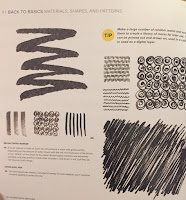
Drawing with patterns and certain shapes can help add element to your artwork. Not only does it add variation to the style of artwork you produce, adding patterns can actually make the process of drawing simpler. "Strengthening your manual dexterity will improve your confidence and ultimately appear in the quality of your marks" (Sherman 24). What Sherman means by this statement is, by using simple patterns and textures of lines in your artwork, you can overall improve in that skill.

On the right and left are examples of  textures and variations of lines shown in Playing with Sketches. To complete this exercise, I used some of the patterns shown in the book to make unique characters.


Sherman states, "You will have the endurance to maintain a consistent line quality and the flexibility to easily change your line work, bringing variety to your image," (24). Overall, this exercise was simple and fun. Those who want to add variety to there artwork should try incorporating line variation.
Do you think using different line textures/variation makes art more interesting? 
Bicknell, Sarah. Sherman, Whitney. Playing with Sketches. Beverly, Rockport Publishers, 2014.


Using Other Senses to Draw

Blindly drawing is a very difficult task, it involves using all senses except for site to draw. Whitney Sherman states"Use the same technique to to take your mind away from what you think an object should look like and allow your hand to freely interpret shapes," (116). While drawing without looking, you have to use your memory to make something presentable.

Above, is the example shown in Playing with Sketches. The book used lettering rather than just normal drawing, however, since I am looking to improve my drawing skills, I chose to blindly draw.
Drawing from memory, while being very difficult, helps you gain a better understanding of the object you are drawing. "When looking at shapes we readily know, such as letter forms or faces in a slightly rearranged formations, we can observe new relationships in the imagery" (Sherman 116). Overall, I would recommend this exercise to anyone who like to gain a better understanding of a certain object like a face. Personally, while doing this exercise I close my eyes and do not lift my pen/pencil.

Do you think drawing an object blindly can help you draw that object overall better?
Bicknell, Sarah. Sherman, Whitney. Playing with Sketches. Beverly, Rockport Publishers, 2014.
Wednesday, January 17, 2018

Sketching Reflective Surfaces


Sketching reflective objects can be hard. But knowing the basic techniques of reflection can help enhance your sketches and take them to a new level. To know how to draw these shinny objects you need to know the basics of reflecting before mastering it. Charlie Bowater suggests knowing your environment and where the light hits your object (80). I agree with this suggestion because knowing you environment helps you to know where and how you would draw your reflection. For example I drew a metal shield; for the environment I drew a sun to symbolize the light coming from the top, along with two rectangular objects, one dark rectangle and one light rectangle.
Now with that environment, you determine the effects of your environment on our object. For example the sun in the middle would reflect a very shinny light, causing the center of your shield to be very light. The side with the dark rectangle would have a dark reflection, and would cause that side to be darker. Where as the side with the lighter rectangle would have a lighter reflection. As you can see from the picture below I have arrows indicating how this part of the environment effected the metal shield.
Beside the environment effecting the object, there are other factors that can effect the the object's reflection. According to Bowater " the consistency of your surface will have the biggest impact on the reflection" (80). Which is quite true because if your object it circular or has rounded edges you have to take those factors under consideration when you think about how your environment and the impact it has on your object. Depending on the consistency, your reflections me change a bit to highlight certain parts. For example if your object is round the reflection would change a bit to capture the roundness of your object and the environment around the object. Or if you have a tube as your object and you are reflecting things off that tube you need to consider how the consistency of the tube will affect the reflections; the effects of the tube will have is  it will reflect your  environment to appear slimmer. Another factor you have to take in consideration is if your object it matte. If so then you object will have a blurred and softer reflection instead of being intense and the smaller details would get lost. Lastly, Bowater suggest you consider the form of your object, because your object will always reflect the environment around it but in different forms (80). Which is true, because when you draw a cube as I have done in the images below, you see the light reflects in in different areas and some sides of the cube are darker than others because light hits it in a different way. Where if I had a shinny sphere it would reflect everything around it, making the scene around the it crammed in the in the reflection.

By taking all these considerations and precautions will help you draw a successful reflective surface, that can help enhance the quality of your sketches.
What object do you find difficult to make reflective? And do you think these tip will help you draw reflective objects and make the process easier?
Bowater, Charlie. Beginner's Guide to Sketching: Characters, Creatures & Concepts. 3DTotal Publishing, 2015.
Sunday, December 31, 2017

Story from a Drawings

From my last blog "Learning new ways to Draw", I stated a question "Do you think that this type of sketching is more appealing than a sketch with lines and structure?". after that last blog I kept reading the book Drawing for the absolute beginner and from that, I have found a reasonable answer to that question. which is that it doesn't matter the way to draw it matter how to implement that skill into the story you're trying to tell in your drawing. "Good art begins with an interesting subject. Be on the lookout for inspiring subjects because your best art will no doubt come from this inspiration" (Willenbrink 105).

So with that in mind, I decided to draw using the different ways of drawing techniques to tell a story. The story I wanted to show and tell is that this is a very old-fashioned man farmer. who is still living in the rural ways of life.

Do you think telling a story is important to do when drawing/sketching something?


Willenbrink, Mark, and Mary Willenbrink. Drawing for the Absolute Beginner: a Clear & Easy Guide to Successful Drawing. North Light Books, 2006.

Drawing techniques: Get Into the Flow of Drawing

An important step in the drawing process is to loosen your hand and mind before you draw, in order to allow your drawing to be as creative as possible. Elaine Clayton gives a couple of techniques to loosen your mind, stating that "It is a way of activating the total mind as it works in unity..."

 All you need for this exercise is a blank piece of paper. Pretend that your pencil is a figure skater, and the paper, a frozen pond, drag the pencil across the paper continuously "skating" across the page. Play around with speed and pressure of your line. When you are done, try to identify any shapes you made. Here is my example of the exercise:

A second technique Elaine suggests is playing with line gradation, or the change from one type of line, to the complete opposite line; for example, light to dark. Here is my exercise:

These drawing warm-ups will help you to draw concisely, accurately, and intentionally. Do you have any warm-ups you do before you draw? Let me know if you have any, and thanks for reading!

Clayton, Elaine. Making Marks: Discover the Art of Intuitive Drawing. Atria Paperback, 2014.


Tuesday, December 26, 2017

Shading Techniques

Shading is an essential part of sketching.  As Bowater states "Shading techniques are very important and prevent your sketches from looking flat" (31).  Which is quite true because the contrast from the dark and the light help your sketches look more realistic and natural. The simplest shading technique are regular and hatching lines. When using this method the line should be parallel and all you do it move your tool left to right or up and down. This technique is the commonly used and can be used on almost every type of drawing says Bowater (31).  You can often see this technique when shading in skin, values, backgrounds, and etc. I have shown this style by drawing a circle and and using this technique to fill in. You can see how it adds a little more dimension to a simple circle.
  The next technique I will be talking about is cross- hatching. It is very similar to regular/hatching lines except you layer the lines on top of each other. In Bowater's words " cross-hatching involves one set of lines crossing over another set, creating volume" (32). Which is the simplest way to define this technique and give sense of of how to do. As you can see I started with another circle and I first did the basic hatching lines (which is the technique mentioned up) then I made another set of lines perpendicular to create the cross- hatching effect. Bowater suggests finding an angle that seems natural and work consistently  when cross- hatching (32).  I believe this is important because when the strokes feel more natural it is easier to shade in your sketches and have a better overall result.
Finally the last technique I would like to cover is circular shading. This technique uses the overlapping of a circular pattern and is very similar to when we scribble/fill in objects except this has the presence of a circular pattern. This is a great way to give more of a solid appearance as well as blend different colors in when sketching in color. You can see that I did this in another circle as I have been doing in my previous examples and you can notice that when you use circular shading you can find see some of the circular pattern mentioned above.
Now these are only 3 shading techniques, there are several other shading techniques and all have a different ways of enhancing your sketches and bringing them to life.
Do you think when shading you should find an angle that feels natural and not just in cross- hatching but any type of shading technique?And why?
 Bowater, Charlie. Beginner's Guide to Sketching: Characters, Creatures & Concepts. 3DTotal Publishing, 2015.

Thursday, November 30, 2017

Learning new ways to Draw

I'm somewhat familiar with drawing or sketching things, I never have just taken time out and decided to draw something but after I found the book called Drawing for the absolute beginner by Mark and Mary Willenbrink. I'm only 40 percent into the book and I've learned so many skills and found out how there are different ways to draw a subject.

There are sketches where yo draw lines to frame the subject just right and even, then value sketches which I tried out where you basically use dark and light pencils to contrast the black and white and create lines without lines. "A value sketch is used to observe a subject without much regard for structural or proportional accuracy" (Willenbrink 18). Mark says that this type sketches help the subject be visible without lines.


Do you think that this type of sketching is more appealing than a sketch with lines and structure?


Willenbrink, Mark, and Mary Willenbrink. Drawing for the Absolute Beginner: a Clear & Easy Guide to Successful Drawing. North Light Books, 2006.

Drawing Space With Character: Character Design From Life Drawing

When drawing characters or people in general, volume is always a key. Volume can make the character look real on the paper with just a few correctly placed lines. Michael D. Mattesi says this, "I believe that the well-rounded draftsperson has the capacity to understand how to draw depth and understand the flat plane of the page at the same time. No matter how well you can depict perspective, form, light, etc., there is real power in understanding that you are still working on a two-dimensional surface" (37).  For me this means that anyone can draw depth and still know that it's a flat piece of paper. 

When trying it out for the first time I used it to make a circle with depth, or a sphere. without the lines in the middle of the sphere it would just look like a regular sketched circle. "...Look how deceiving some simple curves can be on this..." (37). This sphere can also be the start of some head sketches along with a body. 


The second thing that I tried was playing with depth boxes. Depth boxes can be used when making sketches of body parts or anything else that are in different depths. The objects or parts closer to your perspective should be bigger than the objects that are farther away. This grants the illusion of the object being closer or farther on the paper. I attempted to draw a fist coming toward the paper, with the arm in the background. 

Mattesi gives some advice and says, "Look at the bounding boxes around the different areas of the figure [that you are drawing]. In the beginning, do this with realistic purpose. For instance, a foot that is closer to you would be larger than a foot farther away... This happens because of the roundness of our eyes" (44) 


Drawing Techniques: Emotion in your Lines


As an artist, drawing does NOT come easily to me. In my blog, I will try to understand the very basics of  drawing. I will analyze the emotions and feelings that can stem from a single line or shape, and use them to better connect the artist to the goal of their piece of art.

In Elaine Clayton's book, "Making Marks", Elaine has an insightful, although outlandish approach to drawing. She calls her drawings, Intuitive Stream Drawings. These "in the moment drawings" supposedly are insights into our thoughts, feelings, and emotions. Although I don't completely agree with Elaine that stream drawings can interpret our subconscious mind, she is a talented artist with thoughtful techniques. In her book, she states, "Shapes evoke emotion and trigger associations out of the unconscious and into our decision making process, the same way lines can" (Elaine 38). This shows the impact a line can make on a piece of work.

An example of how we can see emotions in lines is in these two:
Study the two lines. What do they make you feel, what do they make you think of? Do you see how one line is relaxed and the other is "angry?"

Artist use these lines in their artwork whether you realize it or not. Look at these two pictures.


Do you still see the same angry and relaxed lines? 

If you look at the sun and moon in reality, the shapes and lines are very much the same, yet they are easily distinguished in a drawing because of how people generally draw them. The sun is bold and bright, it is intrusive, and our eyes are often drawn to it in a picture and in life. The moon on the other hand is inconspicuous, small, enigmatic, and dark. People are not generally drawn to it. The lines used help to highlight these associations.

I think that it is important to be conscious of how artwork affects the audience, and that with the right lines, we can be thoughtful in our drawing.

Thank you for reading! I hope you learned something new! Let me know in the comments what you thought of these techniques and how they affect the effect of the picture.

Clayton, Elaine. Making Marks: Discover the Art of Intuitive Drawing. Atria Paperback, 2014.


Tuesday, November 28, 2017

Drawing Realistic Animals From Photos

Drawing in general is a controversial topic in itself, but drawing realistic things? Animals, especially? How could someone capture every single detail, from the wetness of a dog's nose to the scales of a goldfish? My strong suit in the drawing department is cartoonish, and so realistic drawing seems so out of reach.

The ability to draw, I feel is subject to person. Some people count sketching as drawing, some do not. One thing that people can agree about drawing however is that, if you put emotion behind your art it will shine through.
In this guide on Drawing Realistic Pets From Photographs by Lee Hammond, Hammond expresses the connection between emotion and art. "Artwork is always more inspirational when you are in love with your subject matter." (7.)


Hammond's statement stood out to me through the motivation behind choosing this guide. That motivation would be to draw my own dog, a Siberian Husky puppy named Hiwakea. I agree that using emotion behind artwork makes it easier to accomplish.

Do you agree with Hammond and I: is emotion is the foundation for the motive and inspiration of artwork?

Hammond introduces the use of graphs and how useful they can be. Useful in the sense of proportion - size of the ears, eyes, nose - and for later on shading and blending. The squares isolate the different shapes of the animal, making it easier to emphasize and define. Hammond claims using grids serves as a base for the mentioned techniques. (20). This is Hana the Japanese Cat and my use of graphs.


Hammond, Lee. Drawing realistic pets from photographs. North Light Books, 2005.


Monday, November 27, 2017

Importance of Skin Preparation


Beauty Routine: Importance of Skin Preparation

Why would skincare involve makeup? Beauty starts with smooth, healthy, glowing skin. Many people tend to forget about skin care beforehand and place makeup on directly, resulting in damaged, clogged pores. Preparing your skin before the application of  makeup will ensure you flawless results, as well as increase the longevity of your makeup. Based on the individual products may vary whether you have normal, combination, sensitive, dry, or oily skin type. Include a cleanser, exfoliator, toner, moisturizer, as well as SPF to your daily routine as it creates a barrier between your skin and the harmful UV rays given off from the sun.

Personally, through all four seasons I have very dry skin. Without properly hydrating beforehand, my foundation looks like the Sahara desert. My skin will often flake, and when your base is not cute, you're not cute. Especially in person. But neither is looking like an oil spill appealing. People tend to always complain that, "oh I don't have time". But sad truth is that, we can't all be blessed with normal skin, and have to work for it in the long term

Analyzing your skin will help you recognize your own particular routine that is beneficial for you. So you can go slay all day. But here is some information for educational purposes. Normal skin is ideal as it is neither too dry nor too oily. People with combination skin tend to have an oily t-zone, while having the cruel experience of dry cheeks, or spot dehydration at the same time. Us dry skin people can be flaky, and tend to have a dull complexion. Oily skin is shiny throughout your entire face as it is caused by overactive oil-producing glands. But on the positive note, you'll have beautiful youthful skin longer than me. I'm also very sensitive, and sensitive skin is more complex because it ranges from dry to oily skin, and is easily irritated by many cosmetics  and skincare products.

According to Bobbi Brown, an internationally renowned makeup artist, and CCO of Bobbi Brown Cosmetics, “The skin’s condition can be quickly impacted by changes in the environment, health, diet, and even products chosen in which irritate the skin” (Brown 33).

Cleansing, and toning will tighten pores, and remove excess oil, promoting longevity of the products. Exfoliators will improve skin texture by removing dead skin cells, as well as decreasing the appearance of hyperpigmentation on skin’s surface.

But, hydration is the most significant step of skin preparation as our skin’s tone and flexibility relies on the water content of our tissues drawn from the humidity of the air, as well as moisture added onto the skin’s surface. Adding moisture will help maintain luminosity, and firmness. It's truly the secret to having youthful skin. Products entitled as a moisturizer will plump your skin. Enhance the look, feel, and overall health of your skin. No one likes wrinkles, and big pores am I right? Hence, the right moisturizer will help your makeup application to go on smoothly, and properly adhere to your precious skin.

I tend to go towards products in which don't tighten my skin and tend to be quite hydrating, so it may not appeal to oilier skin. But please, no matter what skin type you have, avoid alcohol. It'll only irritate, and dry out your face significantly causing your pores to create even more oil.

While I could continue to rant about the different types of skin, and the significance of preparing your face before applying makeup, there are 6 tips in which are beneficial, and adhere to all skin types. Use a broad spectrum sunscreen that blocks UV rays, and avoid long periods of direct sunlight. Too much sunlight can cause aging process to quicken. Stay hydrated by drinking water, as well as moisturize. Not only will it help the condition of your skin, but bodily functions as well. Obtain a moisturizer that works for you. For oilier skin types, I recommend using gel bases rather than creams. Do not ever smoke, nor try any form of narcotics. Most importantly, wash your skin gently everyday, and never wear any form of makeup to bed. Will you incorporate skin care to your lifestyle?
Tuesday, January 31, 2017

Space and Detail in Art

"Space is the breath of art." 
Frank Lloyd Wright

"Less is more" is a concept that we sometimes forget about in art. While this may seem contradictory, it is actually a very key component. I, myself, often forget about this. I find myself spending way too much time considering every detail, not considering the piece as a whole. This results in a piece that is too busy and difficult to look at. Along the lines of this concept, Debora Stewart, author of Abstract Art also agrees. She preaches that space is just as important as areas of activity within a composition (Stewart 46). Given her writing, Stewart has completely changed the process I go through when looking for inspiration. I found myself looking at things in my environment that contained not only detail, but space, as well. This highly contrasts to what I would do before, only paying attention to things that were intricate and contained lots of detail. Now, I start to consider both components of space and detail together as a whole, coming to the decision to use my neighborhood and the nature that is visible in it as my inspiration. It contained adequate amounts of both: the sky providing the space while the houses, trees, and the smaller features providing the detail. Stewart's writing reminds me to consider both space and detail in a piece, impacting today's activity through my choice of inspiration. 

One way to add space to a piece is to ensure that the work is not entirely active and busy. Doing this often times makes the piece lack contrast and variety. Stewart would agree with me on this. She says that, "Not every area of the paper has to be filled with detail. Leave some areas open. This helps build atmosphere, energy, and emphasis" (Stewart 46). Going along with this idea, I made sure to consider space and detail while painting my piece. I started of the base of the piece by painting a blue triangle and covering a large portion of the canvas a yellow-green, hoping that the large scale of these two would help add space. Then, I painted a large portion of the two corners orange and white to create even more space, knowing that I could easily make it detailed later if I wanted to. To finish off the piece, I added lines, shapes, and strokes varying in pressure in orange and yellow across the canvas to balance the piece out with detail. To my surprise, my piece to turned out beautiful. But, this is only thanks to Stewart's writing, which reminded me to keep a good ratio of space and detail while I painted, because before, I would've just went about the piece mindlessly. With Stewart's writing, I applied crucial space and detail techniques to my piece, and consequently, my piece ended up embodying energy, atmosphere, and emphasis at the end.


First Layer of Space

Final Product


What are your thoughts on the "less is more" concept? Do you think it applies in art?

              Stewart, Debora. Abstract Art Painting: Expressions in Mixed Media. Cincinnati, OH: North Light,               2015. Print.