Pages

Showing posts with label Creativity. Show all posts
Thursday, January 25, 2018

The Roman Alphabet

The Roman Alphabet

The Blackletter alphabet was very easy for me.  This is why I felt the need to take on a challenge.  The Roman alphabet gives just that.  This may be, for me, one of the hardest style to do.  There is no way to ensure correct spacing, as it is done by the eye (Bennet 118).  Not only that, you also have to add serifs to the letters.  However, hard work pays off and I was very proud of the end results of the alphabet. 

The spacing between the letters of the Roman alphabet may be the hardest part of it all.  As Bennett writes, "The problem is complicated by the fact that measuring and putting equal distances between letters won't do the trick" (Bennet 118).  If you try to put the same amount of spacing between the letters, they will look like they are spaced unevenly and sloppy because of the shape of the letters themselves.  Just like I have suggested for the previous styles of writing, you may want to use a nib width so that you can focus your attention on not only making the letters formatted correctly, but also looking at how the spacing should be.  The nib width will help you see how the the different letters need different types of spacing.  Personally, I didn't use the nib width at first since I wanted to give myself a challenge.  Don't feel hopeless if you need the assistance of the nib width, with practice you will become less and less dependent on it.  Some key advice is to make all the white spaces between the letters seem equal in length,  even though in reality you placed them in unequal distances.  The letters with straight sides need more space and the rounded sides need less space (Bennet 118).  Using these techniques were a little hard at first, but after using them for about five letters, they became very easy,

The serifs are also a bit of a challenge that come with this alphabet,  The serifs need to be placed in the correct positions and have to be not too big or too small.  The best part is that there are different types of serifs, so you can experiment the one that is the easiest for you to make.  The first is the Slab Serif, the one that I use and find the easiest.  The Slab Serif is made after the letter has been draw and is just a straight line (Bennet 118).  There are also joined Slab Serifs that are drawn as the letters are being written.  These serifs should be made with 20 degree pen angle (Bennet 118).  Finally, there is the Pedestal Serif.  This serif is just like the Slab Serif, except instead of a straight line, there is a curved line.  Finding a technique that is the easiest for you will help make your life a little easier while doing this technique. 

I enjoyed this style of Calligraphy since it gave me a challenge that I didn't get before using the other styles that I've tried throughout this journey.  What style was your favorite?

Bennett, Jim. Calligraphy for Dummies. For Dummies, 2007. Print.
Wednesday, January 24, 2018

Roaring Fire: Origami Airplane

I wanted to finish off with a bang for my last paper airplane and what a better way to do it, is to make the "Roaring Fire." When I first saw the design, it looked insanely cool. The skill rating was between the medium and hard side but I knew I had to try it for myself. The description bought me in. "This airplane will light up the sky with its roaring fire. The flames will seem to glide behind the model as they flare across its wings. The large wing area, made by first folding the paper across its width, helps this airplane stay aloft. A powerful launch lifting it high into the air will see it blaze a trail across the sky" (Ono 60). Well, it's time for me to finish this.


Doing it a little differently from other blogs, I am showing the final design before the steps to show you how I got it from just sheet of paper to this.


The Paper Design:
From what I could already tell, the paper was different than the others. It was wider and it looked like it was going to be less complicated than I thought.


Second Step:
"Next turn the tip back so that it sits on the far edge of the paper" (Ono 60).
The first step was the "basic fold both corners onto the middle" so transitioning to the second the step, I had to fold the tip on the edge of the paper.


Third Step:
"Fold the tip back so that the new crease lies half between the new edge and the original flaps" (Ono 60).
When doing this, I made sure to use ruler so I knew if I was lying the new crease in the middle of the original flap. It helped a lot.
After the third step, I flipped the paper over and folded it in half, leading it up to the fifth and final step!


Final Step:
"Place a ruler against the object to make a crisp, angled fold for the wing, starting at the end tips of the plane. Turn over and repeat on the other side to finish" (Ono 60).
The ruler part was super helpful. I would recommend to use it as tool for other paper airplanes to build in the future.


Question:
Have you ever tried something you thought you would never do but end up liking it?


Ono, Mari, and Roshin Ono. Fly Origami Fly. Edited by Robin Gurdon, illustrated by Trina Dalziel, Cico Books, 2010.


The Blackletter Alphabet

The Blackletter Alphabet


After finally learning the basic italic letters of Calligraphy, it's time to experiment with more creative writing styles, such as the Blackletter writing.  This writing is different than the Italic style, and personally much easier, since it only is made up of vertical strokes, is more unique, and overall more creative.  


Just as when first starting to write words and sentences, it may be helpful to take the help of the nib width again.  This way, you can give all the attention and focus on actually writing the letters correctly instead of worrying about the length and neatness of the letters.  This style was very easy for me since it only involves vertical strokes, which are not all that hard to do.  The only slight challenge that I faced was not making the letters slightly slanted as done with with the Italic letters.  As Bennett writes, "It is important to make certain these letters don't have any slant" (103).  Making sure that there wasn't any slant was a little challenging for the first couple of tries, but as I got more practice, my letters were coming out without any slant.  I didn't feel the need to use a nib width for this particular style, since it came fairly easy for me once I got the "no slant" rule down.  If you're having trouble with the slanting, Bennett suggests, "You can lightly pencil in the vertical strokes before you make the letters with a pen"(103).  This technique will be very helpful to avoid slanting the letters.  After using this technique for a while, you should gain the confidence to be able to try to write the letters without the technique,  Don't lose hope if you can't get this technique down right away, with practice it will get easier.

The only letters that are not made of vertical strokes are the capital circular letters, which are C,G,O,Q, and T.  For these letters, the strokes are curved instead of vertical.  The curved strokes are pretty straightforward (103) according to Bennet, and they truly are.  However, if you're having any trouble with the strokes, try to visualize where you want the curved strokes to go before trying with the pen.  Also, make the stroke all in one motion and with even pressure.  Curved strokes, for me, became easier after I stared to pay attention to the amount of pressure I was applying to the pen.  The goal is to have an even pressure throughout the entire stroke.

This style is one of my favorite styles because it looks very complicated but is very easy to draw.  What has been your favorite style while a part of this journey?  Do you find the Blackletter style as easy as I did?

Bennett, Jim. Calligraphy for Dummies. For Dummies, 2007. Print.
Monday, January 22, 2018

Effortless and Easy No-Bake Cheesecakes

Delicious Mini No-Bake Cheesecakes


I decided on making this dessert for my next blog post because I had made more savory dishes previously and thought it would be a good idea to switch it up! This recipe caught my eye because the vibrant colors from the fresh berries made the dish look very appealing. The dish was fairly easy to make because there was no baking time involved, however there was time that you had to chill certain parts of the dish; about 40 min total. The cheesecakes involved the components of a graham cracker crust, a sweet cream cheese layer, fresh berries, more cream cheese and topped off with even more berries!

The way I served them to my family were in cute little mason jars, the perfect serving size. Rachel Hollis had mentioned in her book that "serving a classic dish in small individual portions is an easy way to reinvent your favorites" (Hollis 15). I tried to make the dessert presentation even more adorable by adding a drizzle of raspberry liqueur on top of each cheesecake to compliment the fruit flavor already in the dish. This dish was so simple but made me realize like Rachel had said you can do anything beautifully with style (Hollis 5).  


What kind of cheesecake do you guys prefer? 


Hollis, Rachel. Upscale Downhome: Family Recipes, All Gussied Up. Thomas Dunne Books, St. Martin's Griffin, 2016.  
Wednesday, January 17, 2018

Stealth Jet

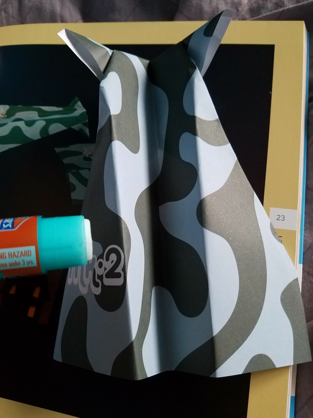
Building my first paper airplane in the book gained me confidence to try one in the harder skill level. it was called the "Stealth Jet." As I was flipping through the pages, it quickly caught my eyes. It looked unique with the front side pointing out like two horn. I couldn't miss the opportunity. The description said, "This jet is a classic and has been made by paper plane enthusiasts for generations. it is known as the '"Squid Airplane"' in Japan because its shape looks like a sea squid!" (Ono 22). Of course, I thought it looked like horns but after reading the description it looks more like squid than anything else. But anyways, this was my attempt for the "Stealth Jet."


The Paper Design:
The paper was about 8x6/21x15 cm. The color combination between dark green and light blue was nice, one of the reasons why I chose this plane.


First Step:
"Make a crease along the center of the paper by folding the colored sides together. Open out the sheet and fold two corners to meet along the central crease" (Ono 22).
From my experience on the "Classic Airplane." My precision to fold both sides has become a piece of cake.


Second and Third Step:
"Turn the paper over and fold both angled edges in to meet along the central crease" (Ono 22).


"Lift up the object and open out the two loose flaps of paper at the pointed end" (Ono 22).
I accidentally skipped this part and went to step 4 which explains the several creases on the paper but I was still able to do it!


Fourth and Final Step:
"Turn back the pointed end making the fold between the two outer points then lift the object and fold it in half along the central crease" (Ono 22).


"Lift the top flap forward to make the wing, making a straight fold about 1/2 in (1.5cm) up from the bottom. turn the paper over and repeat, then place a little paper glue in the space between the wings and press together" (Ono 22). I noticed gluing between the wings was the most important step of the whole design if not added, it wouldn't even like a paper airplane at all! But after gluing it together, the plane was complete and it looked really unique


              Final Design 
Not going to lie, I messed up a little when going through the steps but in the end, I was able to finish. It obviously doesn't look exactly the one I saw in the picture but it was solid. Even if you fail, just keep trying and it will pay off


Have you ever felt so frustrated that you wanted to quit but still kept going until the very end? If so, how did it feel?

Ono, Mari, and Roshin Ono. Fly Origami Fly. Edited by Robin Gurdon, illustrated by Trina Dalziel, Cico Books, 2010.


The Classic Airplane

After learning a few tips from the book. I finally begin to start my first Paper Airplane. It was called the "Classic Airplane." I figured to start on the most basic one so I could try to get a good feel before starting on the other crazy ones. It had a caption which a part of it said, "This classic paper airplane is a model that has been much loved for generations because it flies very well even thought it is so quick and easy to fold" (Ono 18).
                                                                       

My Design:                                                                                                       I've decided to use this paper design to build my first "Classic Airplane" because I noticed this was the only paper that didn't have a specific type of Paper Plane for it.    


First Step:    
"Make a crease down the center of the paper by folding it in half then opening it out again. turn in the corners of one end of the paper so that the sides lie along the central crease with the corners next to each other" (Ono 18).
Like any other airplane, this comes to no surprise to crease it down the center of the paper since it is called the "Classic Airplane."
I am able to do this easily.


Second Step:        
"Fold the new edges in so that they also meet along the central crease" (Ono 18).
Again, I had no problem doing the step of the instructions. The tips from the introduction helped me get an accurate fold.                                              


Third Step:
"Turn back the nose, folding it about 1in (2.5cm) from the end, then turn the object over and close up the plane along the original crease line" (Ono 18).
After this step, I made sure to flatten the paper with a textbook to avoid the paper from hanging out so I didn't have to use my hands to press it down.

Fourth And Fifth Step:
"Turn over the wing at a slight angle so that the plane's body is deeper at to back than the front" (Ono 18).
"Turn the plane over and fold down the other wing so that is exactly matches the first then open out the wings so that they sit together, at right angles to the body" (Ono 18). I didn't feel the need to add any pictures for the last two steps because it was pretty self explanatory.


Do you enjoy doing origami? Why or why not?


Ono, Mari, and Roshin Ono. Fly Origami Fly. Edited by Robin Gurdon, illustrated by Trina Dalziel, Cico Books, 2010.


Saturday, December 30, 2017

Continuing the Art of Calligraphy

Continuing the Art of Calligraphy

Getting down the basics of Calligraphy, just like anything else, is important.  But after learning the basics, which can be boring, the fun begins when you can start writing actual letters and sentences.  With this skill, you can create beautiful letters and cards for the people you love! This next step in learning how to do Calligraphy has benefited me a lot since I can make personalized handmade cards for my family and friends.  

To get a neat and even look, the proportions of the letters should be the same.  This was personally hard for me to do at first, but practicing my writing using the nib width helped me to master this skill down a little bit more.  "Practice the x-shape family letters...Practicing will help you get the feel for it" (Bennet 50).  The letter "x" did help with getting almost exact proportions but to help make my writing look better the letter "v" was also very helpful.  "The trick to getting these letters right is making sure that the sides...are straight...Practice the v shape below" (Bennet 51).  While the letter "x" helps with proportions, the letter "v" helped to make the sides of my letters smooth and consistent throughout my entire writing,  After practicing for a while, you should try to not use the help of the nib width to write the letters "v" and "x" to get these accurate proportions and test yourself to see if you can do it without the help of the nib width. Don't get disheartened if the letters don't come out to be the same size because it took much practice for me to get it down at first too.  

After writing a few letters with the correct proportions, you should encourage yourself to try to write the entire alphabet without the use of the nib width.  If the proportions don't come out right for all the letters, don't lose hope and keep practicing.  With more practice, your letters will continue to be more graceful and effortless.  This may be the most challenging part since I didn't have any many letters mastered besides the letters "v" and "x".  But being patient and thinking about how you want the letters to turn out and the steps needed to get the letters to be like that helped me to get my writing neat with correct and exact proportions.

While practicing writing the alphabet and writing correct proportions, don't forget the right technique of holding the Calligraphy pen that should be set and held at an angle while you're writing.  Applying uneven or inconstant amounts of pressure on the pen while writing will make your writing look sloppy, uneven, and messy (52). Different amounts of pressure on the pen determine how the tip of the pen will be while writing which determines not only the amount of ink but also how thick or thin the letters you write will be. 

Now that you can write the alphabet gracefully and neatly using Calligraphy, the next big step is to finally start writing sentences and actual words using the right techniques!  Do you think Calligraphy will be hard or easy, and do you think it's really worth all the extra effort?

Bennett, Jim. Calligraphy for Dummies. For Dummies, 2007. Print.
Sunday, January 29, 2017

Wild Flower Pencil Topper

For my last blog i  will be demonstrating how to make adorable "Quick and Easy" (Wallenfang, 10) Wild Flower Pencil Topper(s).


Materials Needed
Duct Tape ( Assorted colors, Prints are optional)
Scissors
Pencil(s)

Steps:
1. Make an offset strip (Wallenfang, 7) for petal. Make another 1 in a different color for the fringed center.

2. Make a double-sided (Wallenfang, 7) strip for the leaves. Freehand cut the petals and leaves

3.Wrap pencil(s) with chosen tape, Wrap and tape the Fringed center around the pencil.

4. Finish of with taping the petals and leaf to the straws.


What changes have you made to crafts and how did they turn out?


Wallenfang, Patti. Just Duct Tape It! Little Rock, AR: Leisure Arts, 2011. Print.
Saturday, January 28, 2017

Duck Tape Clutch/Wallet

 Hello Bloggers!


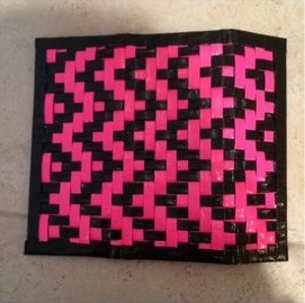
Today I'am going to be posting about how to create a quick and easy clutch made from a duct tape.


Materials
2 Colored Duct tapes
Scissors
Hook and loop Fastener (OPTIONAL)


Steps
1.  Make a 7 1/2" X 11 1/2" double-sided sheet (Wallenfang, 44), with a colored tape. Cover the edges with second tape.
2. Bill Holder: Make a 7 1/2" X 3" double sided Sheet; tape to the clutch inside.
3. Card Pockets: Make a 20" Double-sided tape strip ( Wallenfang, 7). Cut 6 Pockets and cover the Edges.
4. Tape the pockets together; tape each  pocket separately.
5. Tape the Pockets in place
6. Fold the clutch in thirds and add the hook and loop fastener ( OPTIONAL)


What kind of combinations have you made in a craft? if so how did it turn out?

Wallenfang, Patti. Just Duct Tape It! Little Rock, AR: Leisure Arts, 2011. Print.

Wednesday, November 30, 2016

Mastering Manga


Mastering Manga 2 by Mark Crilley
        First, draw a round circle, with straight vertical line dividing it in half and a horizontal line in the middle.  At the bottom half, draw three more horizontal lines and a triangle pointy shape for the jaw in light pencil (Crilley, 12).  This sets up the whole female manga profile to be exact and provides guidelines for the rest of the face.  I have tendency to draw the face features out of proportions so drawing lines in advance helps me measure where to place certain parts such as the eyes, nose, and mouth.  This step is the beginning step and therefore the most important as the rest of the drawing depends on how well rounded the face shape is and keeps the whole profile intact.  This base increases the precision of the whole picture itself and is the beginning foundation of the manga.
       “There are hundreds of ways to draw manga hair.  The upper line of the hair is drawn a fair distance above the circle.  This contributes to the youthful look of the character" (Crilley, 13).

It has very detailed instructions how to shape the face and how to match it to the character itself.  If your character has to have a certain personality, their face should reflect that and good explanation to why something was drawn that way, builds on reason.  This quote gives me a way to gauge how I want to shape my character’s personality through the face.  As I aimed for a younger girl, I needed to be careful how the hair swayed and hanged on her head in order for her to look her age.  This step definitely tested my patience, as I had a strong will to make my character perfect. The hair was definitely the hardest part for me, so this helped me focus with the visual and description of the position of the hair.  This was the step I took the most time on, as the little hooks and crannies of the hair completed my picture and was the limit of my patience.

Is the beginning part of drawing manga more important or are the details more significant?
Crilley, Mark. Mastering Manga 2: Level up with Mark Crilley. Cincinnati, OH: Impact, 2013. Print.