Pages

Showing posts with label Abstract Art. Show all posts
Sunday, January 28, 2018

A relaxed attitude about drawing

So far, we've examined lines, and the emotions they convey, as well as how they affect the outcome of the drawing. We've examined different ways to warm up before we draw to prepare our mind for artistic expression, as well as the job of the onlooker in a piece of art. Finally, I will leave you with a lasting outlook on drawing, and the art you create.

Art and artistic expression has been around since the dawn of humans. We have always tried to express ourselves through less and less logical or conventional methods. One of the more simpler expressions is drawing. Today, I want to impress upon you the importance of having a relaxed attitude about your drawings and creations. 

This outlook is very important for every artist for several reasons. First: It allows your body to not be tense, to feel flexible and even spontaneous. Second: Ultimately, an artist must express themselves, and, as Clayton states, "The process [is] more important than the product" (5). Third: It allows drawing to be a lot less of chore, and more of a fun release of creative energy. I struggle a lot with trying to draw precisely or not relaxed, and it makes my drawings stiff, and frankly, terrible.

Here are some quick drawings I did, for no other purpose than to relax and have fun.


Do you find that drawing to relax produces better results than drawing to produce results?

Clayton, Elaine. Making Marks: Discover the Art of Intuitive Drawing. Atria Paperback, 2014.

Perception of lines: A creative approach

In my past posts, I have talked extensively about how different lines affect the mood of a piece of art, and this week, I will further this concept. Previously we have explored how lines feel, and now we will look into the role of the viewer of a piece of art.

I have repeatedly spoken to the importance of using lines in art, and the effect it has on a viewer, and now we will put ourselves in the role of the viewer. Elaine Clayton states, "We use our five senses to give context , or meaning to everything we encounter. Art forms such as lines and shapes represent elements from our experiences in the world, either symbolically or literally" (26). In other words, the artwork that an artist produces is only the beginning of the artwork, and the viewer's interpretations complete it.

This picture is an example that Elaine uses to demonstrate how to use your interpretation of drawings. The lines and shapes alone seem to more sad than energetic. The downward slope of the line, and the gentle wave creates this emotion. Although it has no recognizable shape, we can still see the emotion behind it.

Here we have the same picture, but rotated. The rotation brings to light what the shape actually is: an eye with a tear drop. We saw the saw the shapes as themselves, unattached to a finished product. Art is what we make of it. Do you find this to be true?

Clayton, Elaine. Making Marks: Discover the Art of Intuitive Drawing. Atria Paperback, 2014.


Landscapes

Art comes in many different forms, often accompanied by people, but there are some art forms that are not. Landscapes and still lifes are more complex, as when there are people in painting, its easier to see the story that the art trying to tell. Landscapes are made to be interpretative by the viewer, but understanding the artists point of view when the piece was created can also be helpful. It may allow for more emotions to be provoked, as well as just add another level of understanding.

"Panoramas are almost always idealized... or even entirely imaginary. It's all about what the author wants you to see" (Idema 3). Landscape painting are not simply that- they are expressions of creativity and imagination. The point of art has always been about how an artist can express themselves, and about how the people looking at them interpret the art. Being able to see how someone could come up with an entire piece of scenery is very important to understanding the purpose and meaning behind it.


The time period also has an effect on what a landscape can stand for. Johan Idema wrote about how landscapes developed, starting with precision, but moved closer to impressionism as time went on (3). Art is something that is constantly developing and changing, so the art style used can easily have an effect on your interpretation of the piece.

Trying to put myself in the artists place, and playing closer attention to details helped me understand the landscapes better. Learning about the time period that it was made, while also noticing those small, little additions made me also appreciate it more. I often felt nostalgic while looking at the art, which was surprising, as I never found myself to be drawn towards nature, but also felt natural. Using different point of views helped me understand it more as well.

What is your favorite landscape painting?

Idema, Johan. How to Visit an Art Museum: Tips for a Truly Rewarding Visit. BIS Publishers, 2014.
Friday, January 26, 2018

Security

We often ignore security officers in our day to day lives. We try our best not to interact, intimated by their stature and their uniforms, but, in the world of museums they can often be quite helpful. Johan Idema talks about how security guard are not seen as people full of knowledge, but simply people who are meant to protect and prevent items being stolen, while they normally have inside information about the topics of certain exhibits (1).

I was able to talk to a security guard at a museum during my most recent visit, and I got a lot of additional background information about it. Idema stated, "many guards would speak with great passion, if only we asked them" (1), which I found to be the case when I talked to one.


While at the Bellevue Art Museum, there was an exhibit open called "Searching Home". While talking to the security guard working at the museum, I was able to obtain additional information about the piece. The entire exhibit was carved out of wood. Suitcases, bar link fences, everything. The artist behind it, Humaria Abid, was told when she was young that she would never be able to work with wood, as in her country, carpentry was seen as a mans profession. Abid was able to over come those stereotypes, and built this exhibit to represent immigrants and immigration. With out talking to the guard, I would have never learned this information, and would have just simply thought it was cool, but never be able to understand the deeper meaning.

What kind of information did you obtain from an unlikely place/person?

Idema, Johan. How to Visit an Art Museum: Tips for a Truly Rewarding Visit. BIS Publishers, 2014.

Basic Origami

Basic Origami

Not ever origami piece you create should be complex and contains hundreds of folds, sometimes it just important to keep it simple. When you first hear about what basic origami is, you find that most people think of the crane. But even though it may be the first one you hear about, it is not actually a basic model, there are some much easier models that are better to start with if you're a beginner. "all origami basic origami can be broken down into mountains folds and valley folds. Mountain folds indicated dot-dot-dot dash lines, are convex like a mountain ridge"(Shaffer 32). vertical (mountain folds) and horizontal lines (valley folds) are much easy to complete in origami. Folding opposite sides from each other help build a greater product. 


"there are enough fabulous origami models out in the world, already exquisitely designed and diagrammed to keep a fanatic folder occupied for years" (Shaffer 14). No, i'm not saying that you should limit your creativity ability, i'm simply saying that origami doesn't always have to consist of hardship and precise placement. Much like the origami cat at i'm doing for this blog. the origami cat is simply basic but still has value. 


whats your favorite basic origami?  

Shaffer, Jeremy. “Origami to Astonish and Amuse.” Amazon.com, 6 July 2001, www.amazon.com/Origami-Astonish-Amuse-Jeremy-Shaffer
Thursday, January 25, 2018

Final way to Draw

After all the blogs I've done on the book Drawing for the absolute beginner. After all of  that the author is trying to tells us that it doesn't matter if you use lines, shapes, dots or whatever. Their are many techniques to have your drawing advanced and more appealing to look at. Even if you use those techniques or not you'll still get a drawing that you created by yourself with your own hands and that everyone is an artist. I think that is what the author believes and which couldn't be more agreeable. " Our belief is that everyone is an artist, and that includes you!"(Willenbrink 7).

These are my shot at the techniques this book teaches and things I've learned throughout this blog series. I've learned a lot new things after reading this book.
   

Do you plan on drawing something of your own soon?


Willenbrink, Mark, and Mary Willenbrink. Drawing for the Absolute Beginner: a Clear & Easy Guide to Successful Drawing. North Light Books, 2006.

Learning from other types of drawing

The past blogs I've been drawing and sketching things that looked easy for me, but in the book Drawing for the absolute beginner the author the opposite and wants you to try new things and never be comfortable. "you may have a knack for drawing faces but feel like you can't draw a building in perspective to save your life...then you will not gain experience...Challange yourself" (Willenbrink 54). The author is suggesting that if  for example your good at drawing trains and automobiles but can't even try to draw a house than your not challenging yourself to get better and gain experience.

I've always had troubling drawing animals because I would never get their body parts to be same. But I decided to challenge myself by trying out to draw a swan. I still think I messed up on some parts of the swan like its beak, But now I have the knowledge to fix future mistakes such as the beak.


Can you still learn new experiences from being in a comfortable spot all the time?


Willenbrink, Mark, and Mary Willenbrink. Drawing for the Absolute Beginner: a Clear & Easy Guide to Successful Drawing. North Light Books, 2006.

Using Contrast

I never noticed how important contrast was until I came across the chapter "Values" in the book Drawing for the absolute beginner. This chapter shows how you need contrast to show the differences between the subject and background, just like a photograph you need to focus on the subject and blur the background out. "Values are the degrees of light and darkness in a drawing. They give additional dorm and depth" (Willenbrink 48).


This drawing is about wood and how contrast separates it from the rest of the picture. Also shows how dark the space is below the wood.


Do you think that having a lot of contrast in a drawing in a picture gives it depth and makes the subject stand out?


Willenbrink, Mark, and Mary Willenbrink. Drawing for the Absolute Beginner: a Clear & Easy Guide to Successful Drawing. North Light Books, 2006.
                             

The Roman Alphabet

The Roman Alphabet

The Blackletter alphabet was very easy for me.  This is why I felt the need to take on a challenge.  The Roman alphabet gives just that.  This may be, for me, one of the hardest style to do.  There is no way to ensure correct spacing, as it is done by the eye (Bennet 118).  Not only that, you also have to add serifs to the letters.  However, hard work pays off and I was very proud of the end results of the alphabet. 

The spacing between the letters of the Roman alphabet may be the hardest part of it all.  As Bennett writes, "The problem is complicated by the fact that measuring and putting equal distances between letters won't do the trick" (Bennet 118).  If you try to put the same amount of spacing between the letters, they will look like they are spaced unevenly and sloppy because of the shape of the letters themselves.  Just like I have suggested for the previous styles of writing, you may want to use a nib width so that you can focus your attention on not only making the letters formatted correctly, but also looking at how the spacing should be.  The nib width will help you see how the the different letters need different types of spacing.  Personally, I didn't use the nib width at first since I wanted to give myself a challenge.  Don't feel hopeless if you need the assistance of the nib width, with practice you will become less and less dependent on it.  Some key advice is to make all the white spaces between the letters seem equal in length,  even though in reality you placed them in unequal distances.  The letters with straight sides need more space and the rounded sides need less space (Bennet 118).  Using these techniques were a little hard at first, but after using them for about five letters, they became very easy,

The serifs are also a bit of a challenge that come with this alphabet,  The serifs need to be placed in the correct positions and have to be not too big or too small.  The best part is that there are different types of serifs, so you can experiment the one that is the easiest for you to make.  The first is the Slab Serif, the one that I use and find the easiest.  The Slab Serif is made after the letter has been draw and is just a straight line (Bennet 118).  There are also joined Slab Serifs that are drawn as the letters are being written.  These serifs should be made with 20 degree pen angle (Bennet 118).  Finally, there is the Pedestal Serif.  This serif is just like the Slab Serif, except instead of a straight line, there is a curved line.  Finding a technique that is the easiest for you will help make your life a little easier while doing this technique. 

I enjoyed this style of Calligraphy since it gave me a challenge that I didn't get before using the other styles that I've tried throughout this journey.  What style was your favorite?

Bennett, Jim. Calligraphy for Dummies. For Dummies, 2007. Print.
Wednesday, January 24, 2018

The Blackletter Alphabet

The Blackletter Alphabet


After finally learning the basic italic letters of Calligraphy, it's time to experiment with more creative writing styles, such as the Blackletter writing.  This writing is different than the Italic style, and personally much easier, since it only is made up of vertical strokes, is more unique, and overall more creative.  


Just as when first starting to write words and sentences, it may be helpful to take the help of the nib width again.  This way, you can give all the attention and focus on actually writing the letters correctly instead of worrying about the length and neatness of the letters.  This style was very easy for me since it only involves vertical strokes, which are not all that hard to do.  The only slight challenge that I faced was not making the letters slightly slanted as done with with the Italic letters.  As Bennett writes, "It is important to make certain these letters don't have any slant" (103).  Making sure that there wasn't any slant was a little challenging for the first couple of tries, but as I got more practice, my letters were coming out without any slant.  I didn't feel the need to use a nib width for this particular style, since it came fairly easy for me once I got the "no slant" rule down.  If you're having trouble with the slanting, Bennett suggests, "You can lightly pencil in the vertical strokes before you make the letters with a pen"(103).  This technique will be very helpful to avoid slanting the letters.  After using this technique for a while, you should gain the confidence to be able to try to write the letters without the technique,  Don't lose hope if you can't get this technique down right away, with practice it will get easier.

The only letters that are not made of vertical strokes are the capital circular letters, which are C,G,O,Q, and T.  For these letters, the strokes are curved instead of vertical.  The curved strokes are pretty straightforward (103) according to Bennet, and they truly are.  However, if you're having any trouble with the strokes, try to visualize where you want the curved strokes to go before trying with the pen.  Also, make the stroke all in one motion and with even pressure.  Curved strokes, for me, became easier after I stared to pay attention to the amount of pressure I was applying to the pen.  The goal is to have an even pressure throughout the entire stroke.

This style is one of my favorite styles because it looks very complicated but is very easy to draw.  What has been your favorite style while a part of this journey?  Do you find the Blackletter style as easy as I did?

Bennett, Jim. Calligraphy for Dummies. For Dummies, 2007. Print.
Tuesday, January 23, 2018

Writing Calligraphic Words

Writing Calligraphic Words

At the beginning of this journey, I didn't think that I would get this far.  Writing letters in Calligraphy, for me, seemed unrealistic.  Now, I've gotten enough practice to start writing words!  This is a huge milestone for anybody learning how to do Calligraphy, since at this point, you can officially start writing letters, making gifts, or unique and personalized home decor. 

While writing letters, two things are very crucial.  As Bennett states, "You not only need to know how to space letters within a word, but also need to practice how to space the words themselves" (53).  Just like this, the spacing between the words should not be so wide that they look like they are not a part of the sentence but instead are random words.  However, the spacing should not be so little that the words look crammed and are indistinguishable from each other.  

The ideal way to know that you have perfect spacing is, as Bennett states, "enough space to fit a letter o"(53).  The letter "o" should perfectly fit between any two words in a sentence.  From personal experience, this is not as easy as it sounds.  I had a lot of trouble while making sure my spacing is correct since I had a tendency to make the spaces too wide.  However, as I progressed along, I started getting more and more better.  The key is to imagine the letter "O" after writing the first word and before writing the second word.  This helped me to start writing at a place where the spacing was wide enough but not small enough to fit the letter "o". 

This is a major step from just writing letters and not caring about the spacing to writing actual words while being careful with the spacing.  The spacing between the words is what decides how nice and neat the words look (53)>  Don't be discouraged if the words or the letters don't come out right, it took me a couple tries before I started getting comfortable writing words.  What may help, is to redraw the nib width, as you did in the beginning while getting used to the Calligraphy pen.  The nib width will help you get the dimensions of the letters right automatically, so you can focus all your attention on the actual spacing between the words.  After you get comfortable with the spacing, encourage yourself to get rid of the nib width and write a few words without it.  If you take the nib width away but need it again, feel free to continue using it until you are ready to try writing words again without it.

Calligraphy, just like anything else in life, demands not only patience but also perseverance.  With time and practice, your letters and words will continue to come out more smoothly and precisely.  The spacing will also improve over time, just like mines did.  No matter how good you get at Calligraphy, you can always improve.  Even after practicing for such a long time,  I find my letters coming out much neater and correctly spaced compared to the previous day.  Do you think Calligraphy, just like everything else in life, demands patience and perseverance and will become fruitful in the long run? Why or why not?  

Bennett, Jim. Calligraphy for Dummies. For Dummies, 2007. Print.
Sunday, January 21, 2018

Using Line Variation in Your Art

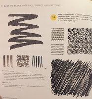
Drawing with patterns and certain shapes can help add element to your artwork. Not only does it add variation to the style of artwork you produce, adding patterns can actually make the process of drawing simpler. "Strengthening your manual dexterity will improve your confidence and ultimately appear in the quality of your marks" (Sherman 24). What Sherman means by this statement is, by using simple patterns and textures of lines in your artwork, you can overall improve in that skill.

On the right and left are examples of  textures and variations of lines shown in Playing with Sketches. To complete this exercise, I used some of the patterns shown in the book to make unique characters.


Sherman states, "You will have the endurance to maintain a consistent line quality and the flexibility to easily change your line work, bringing variety to your image," (24). Overall, this exercise was simple and fun. Those who want to add variety to there artwork should try incorporating line variation.
Do you think using different line textures/variation makes art more interesting? 
Bicknell, Sarah. Sherman, Whitney. Playing with Sketches. Beverly, Rockport Publishers, 2014.


Using Other Senses to Draw

Blindly drawing is a very difficult task, it involves using all senses except for site to draw. Whitney Sherman states"Use the same technique to to take your mind away from what you think an object should look like and allow your hand to freely interpret shapes," (116). While drawing without looking, you have to use your memory to make something presentable.

Above, is the example shown in Playing with Sketches. The book used lettering rather than just normal drawing, however, since I am looking to improve my drawing skills, I chose to blindly draw.
Drawing from memory, while being very difficult, helps you gain a better understanding of the object you are drawing. "When looking at shapes we readily know, such as letter forms or faces in a slightly rearranged formations, we can observe new relationships in the imagery" (Sherman 116). Overall, I would recommend this exercise to anyone who like to gain a better understanding of a certain object like a face. Personally, while doing this exercise I close my eyes and do not lift my pen/pencil.

Do you think drawing an object blindly can help you draw that object overall better?
Bicknell, Sarah. Sherman, Whitney. Playing with Sketches. Beverly, Rockport Publishers, 2014.
Sunday, December 31, 2017

Story from a Drawings

From my last blog "Learning new ways to Draw", I stated a question "Do you think that this type of sketching is more appealing than a sketch with lines and structure?". after that last blog I kept reading the book Drawing for the absolute beginner and from that, I have found a reasonable answer to that question. which is that it doesn't matter the way to draw it matter how to implement that skill into the story you're trying to tell in your drawing. "Good art begins with an interesting subject. Be on the lookout for inspiring subjects because your best art will no doubt come from this inspiration" (Willenbrink 105).

So with that in mind, I decided to draw using the different ways of drawing techniques to tell a story. The story I wanted to show and tell is that this is a very old-fashioned man farmer. who is still living in the rural ways of life.

Do you think telling a story is important to do when drawing/sketching something?


Willenbrink, Mark, and Mary Willenbrink. Drawing for the Absolute Beginner: a Clear & Easy Guide to Successful Drawing. North Light Books, 2006.

Wednesday, December 20, 2017

The Benefits of Drawing With Your Non-dominant Hand

"Relying on my memory of forms, I challenged my unskilled 'other' hand to recall those shapes. The goal was not to get better at drawing with my non-dominant hand, though in short order I could see improvements. The goal was to see my accidents, memorize them ... and overall look of my artwork," (Sherman 68). According to Sherman, as difficult as using your non-dominant hand is, it can be very useful for recognizing your stylistic mistakes and common mess ups you make in your artwork. Below are some examples of art shown in the book that compare and contrast dominant and non-dominant hand drawings.


"By using your non-dominant hand, you will discover a new language for your line and form," (Sherman 68). To attempt this activity I used my left hand to draw a person, like shown in the book. Although this exercise is about improving mistakes rather than just learning to draw in certain way, I was pretty impressed with what my left hand can draw.
I would highly recommend others to try this activity if they have basic drawing skills (because is will admit, this is a lot harder than normal drawing). I definitely enjoyed drawing in a new way, so I will likely try this again.

My question is, Do you guys think using your non-dominant hand to draw, can help you improve your artistic skills?
Bicknell, Sarah. Sherman, Whitney. Playing with Sketches. Beverly, Rockport Publishers, 2014.


Thursday, November 30, 2017

Learning new ways to Draw

I'm somewhat familiar with drawing or sketching things, I never have just taken time out and decided to draw something but after I found the book called Drawing for the absolute beginner by Mark and Mary Willenbrink. I'm only 40 percent into the book and I've learned so many skills and found out how there are different ways to draw a subject.

There are sketches where yo draw lines to frame the subject just right and even, then value sketches which I tried out where you basically use dark and light pencils to contrast the black and white and create lines without lines. "A value sketch is used to observe a subject without much regard for structural or proportional accuracy" (Willenbrink 18). Mark says that this type sketches help the subject be visible without lines.


Do you think that this type of sketching is more appealing than a sketch with lines and structure?


Willenbrink, Mark, and Mary Willenbrink. Drawing for the Absolute Beginner: a Clear & Easy Guide to Successful Drawing. North Light Books, 2006.

Drawing Techniques: Emotion in your Lines


As an artist, drawing does NOT come easily to me. In my blog, I will try to understand the very basics of  drawing. I will analyze the emotions and feelings that can stem from a single line or shape, and use them to better connect the artist to the goal of their piece of art.

In Elaine Clayton's book, "Making Marks", Elaine has an insightful, although outlandish approach to drawing. She calls her drawings, Intuitive Stream Drawings. These "in the moment drawings" supposedly are insights into our thoughts, feelings, and emotions. Although I don't completely agree with Elaine that stream drawings can interpret our subconscious mind, she is a talented artist with thoughtful techniques. In her book, she states, "Shapes evoke emotion and trigger associations out of the unconscious and into our decision making process, the same way lines can" (Elaine 38). This shows the impact a line can make on a piece of work.

An example of how we can see emotions in lines is in these two:
Study the two lines. What do they make you feel, what do they make you think of? Do you see how one line is relaxed and the other is "angry?"

Artist use these lines in their artwork whether you realize it or not. Look at these two pictures.


Do you still see the same angry and relaxed lines? 

If you look at the sun and moon in reality, the shapes and lines are very much the same, yet they are easily distinguished in a drawing because of how people generally draw them. The sun is bold and bright, it is intrusive, and our eyes are often drawn to it in a picture and in life. The moon on the other hand is inconspicuous, small, enigmatic, and dark. People are not generally drawn to it. The lines used help to highlight these associations.

I think that it is important to be conscious of how artwork affects the audience, and that with the right lines, we can be thoughtful in our drawing.

Thank you for reading! I hope you learned something new! Let me know in the comments what you thought of these techniques and how they affect the effect of the picture.

Clayton, Elaine. Making Marks: Discover the Art of Intuitive Drawing. Atria Paperback, 2014.


Don't Wander- Observe

Museums hold the greatest pieces of art known to man. The art ranges from different values and different styles, and each piece has its own unique connotation and creative outlook on the world. The museums in themselves that holds these masterpieces, how ever, only seem to have one purpose and one activity- a place where we can wander around looking at art. Johan Idema stated, "We turn into better observers when sitting down" (23). sitting down simply allows us to focus more, as our brain isn't focused on standing, but rather on the things happening in the world around us.

Museums are often seen as boring, as you simply feel like the only thing to do is to walk around and look, but you can always do more then that. Scattered through out museums are benches and places to sit, not simply for you to have a place to relax if you get tired of walking, but to give you the opportunity to slow down, and look. Idema explains how having benches and furniture around the museums makes us feel like we are at home and rather than a museum, and slows us down to process the art that we are looking at, and allows us to try and come up with what the art means to us.
When applying this technique, I felt as if I wasn't being as rushed, and I had more time to absorb the art and take in the details of the pieces. It made me appreciate the pieces of art more. I found it much easier to pinpoint what I exactly liked about a certain art piece. Combining this with walking up closer to the paintings afterward, it also allowed me to enjoy the art more, as it gave me a different point of view while looking at the art.

How do you feel like this could be applied to your everyday life, and not just a museum?

Idema, Johan. How to Visit an Art Museum: Tips for a Truly Rewarding Visit. BIS Publishers, 2014

Sunday, November 26, 2017

Using Common Materials in your Artwork

"This exercise is an adaptation called the Exquisite Corpse... the drawing is constructed using sticky notes... Using them spurs collaboration and promotes healthy competition... As the drawing grows, so does the opportunity to grow the drawing's complexity," (Sherman 54). This artistic exercise is based on a group of people working together to add to an art piece. In this exercise you and others add a sticky note and add to the artwork that was there previously. Here, below, are some examples shown in the book.
 The book states that this activity is commonly done by "inviting friends or colleagues," (Sherman 54). However, In this activity I decided not to work with others, but by myself, (since the purpose of reading these books is to boost our personal skills), So I added a sticky note each day and added to the art I had made the previous day. Overall I feel this activity was nice to try, and I did feel that this was abstract compared to the art I normally prefer to do.
I would highly suggest this activity to others if they wanted to attempt something other than their normal artwork. I feel many people could gain from this activity. So my question for you reading this blog post is,
Does working with others to make artwork help improve your artistic abilities?
Bicknell, Sarah. Sherman, Whitney. Playing with Sketches. Beverly, Rockport Publishers, 2014. 


Importance in Variation of Art

"When I started Art school, I had a Yale-trained drawing teacher, Micheal Economos, ... His reputation for hard work and relentless exercises  preceded him. Here is the first exercise, ... the one that made us mentally salivate for an organic shape to draw, the one that made me a better drawer," ( Sherman 20). The quote from the author above, speaks about special exercises using different types of line variation to create unique art and improve your skills as an artist. Here, below, are some of the examples shown in the book to give an idea of how people could use lines to make unique art.
 Overall, I think stepping out of your artistic comfort zone can be scary, but after you attempt an exercise like this, you may enjoy drawing more when there is a special twist to your drawing. As stated in the book, "this activity works to improve your skills," (Sherman 20). Personally, while I attempted this activity, I didn't see any improvement in my artwork, however it was a cool style of art to work with. I would highly suggest others to try this style of art or take on this type of activity.
Above, is my attempt at working with this artistic exercise. I used only lines in my artwork to fit in with the description of the exercise. Although this is not my favorite work made, I did highly enjoy trying a new type of style and attempting something I had never tried before.

Does trying different art styles (such as this one), improve your artistic abilities?
Bicknell, Sarah. Sherman, Whitney. Playing with Sketches. Beverly, Rockport Publishers, 2014.