Today, we will be making our own DLC operator showcase, like this one for the Brazilian BOPE unit.
In order to do this, we'll need a couple of things.
-Two operator profiles (look & name)
-Two operator icons that fit the character's ability
-Fitting background and blending
Its a bit complicated, so this'll take a bit. To help us out, we'll be referring to Alexander Mayward's Guide to Photoshop CC.
For starters, we'll need to tie down our theme. While you can do just about anything, we'll be making a showcase for the Ukrainian BERKUT unit. This post will focus on the graphical design, so the actual abilities and backstory of these characters aren't important.
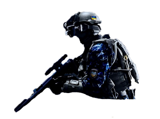
The first operator will be Voroshbyt, a trained marksman equipped with a precision scope and high powered rifle. His character is focused on accuracy and lethality.
In order to highlight his attributes, I made an operator icon consisting of a scope zeroed in on a skull. After I got the main icon made, I added some grunge to signify his rugged personality. Lastly, I added some lines in the back to for added clarity.
Next up is Khmara, an experienced soldier with access to radioactive gas. Geneva certainly wouldn't approve. He is a disciplined soldier who will go to any lengths, legal or not, to get the mission done.
In order to tie the two operators together, I chose a squadmate of the character I used for Voroshbyt. Their similar uniforms and headgear distinguishes them from the rest of the R6 cast.
Khmara's defining trait is his use of radioactive weapons. As such, that will be the focus of his icon. Since the weapon is in the form of a gas, I made the radioactive symbol with gas. I was pretty satisfied with the icon, so I only added a bit of detail to make the icon look more professional.
Now that we have our operators and symbols, all we need to do is throw them on a background and add some text. We will also use the Ukrainian flag to show which country they represent at a glance. After the project is put together, I added some small effects for flair. With all said and done, it turned out like this.
Looks nice! Now that its completed, just export and share it with whomever you choose. If you wish, you can put a watermark to discourage others from stealing your work, but I found that it took away from the aesthetic. Now that you've seen how to make a showcase, would you be interested in making your own? If so, what country and unit would it be on?
Works cited:
Mayward, Alexander. Photoshop Cc 2015: an Easy Beginner's Guide. Alexander Mayward, 2015.
Rainbow Six Siege is a Ubisoft property. The character models used for the operators are from Crysis 3.


I really enjoyed playing rainbow siege, but I never thought you could make your own team of characters like you did. Thanks for the tips:)
ReplyDeleteDefinitely! It can be a pain to get the detail right with the masking, but I'd say it was worth it.
DeleteGreat post. I am not a gamer at all, but I did love reading the content of your post. Keep up the good work.
ReplyDeleteYou should work for Ubisoft with ideas like this. I approve of this greatly, since rainbow six siege is one of my favorite games.
ReplyDeleteI've actually worked with other content creators before, creating banners and formatting some of their branding. But Ubisoft may be a bit too much for me- I greatly value creative freedom when I do Digital Design. I'm glad you enjoyed it!
DeleteHey Cody, I find video game characters really interesting and this is a cool way of showcasing them. Also if I were to make my own showcase, it would probably be Fuze and Blitz.
ReplyDeleteI agree! When you aren't limited by a budget or the restraints of reality, you can come up with some cool characters. Fuze and Blitz would be nice to make- the combination of explosions and Blitz's flash would make for an interesting piece.
Delete